Overview
Images play a key role in the guest experience. Each section of the CMS may display images differently depending on its layout and purpose within the guest app.
This article provides recommended technical specifications for images across different CMS sections to ensure consistent and high-quality display.
For each section, you’ll find:
- The recommended technical specifications
- Instructions on how to access and configure the component
- A visual reference including both the CMS configuration and how the image appears in the guest app
Following these guidelines helps prevent cropping, distortion, and inconsistent visuals across your app.
Before getting started
Before uploading images to the CMS, keep the following in mind:
- These specifications are guidelines. Images may adapt automatically depending on where they are displayed, but following these recommendations helps avoid unexpected cropping or distortion.
- If a component allows you to choose between using the service image or uploading a custom image, remember that the original service image may not display as expected due to differences in aspect ratio or layout.
- When uploading multiple versions of the same image (for example, 4:3 and 1:1), always use distinct file names.
If you prefer to upload images from the Images section (instead of uploading them individually per section), it is especially important to use clear and structured naming conventions. Including the target section in the file name (e.g., restaurant_widget_3-1.jpg) can help you quickly identify and reuse the correct version later.
Taking a few minutes to prepare and name your images properly will save time and prevent display issues across the app.
Important: Images that do not match the recommended aspect ratio may be automatically cropped or resized depending on the component.
Image requirements by CMS section
1. My app section
This section covers all image requirements for elements configured under the My app section of the CMS, including the header and homepage widgets.
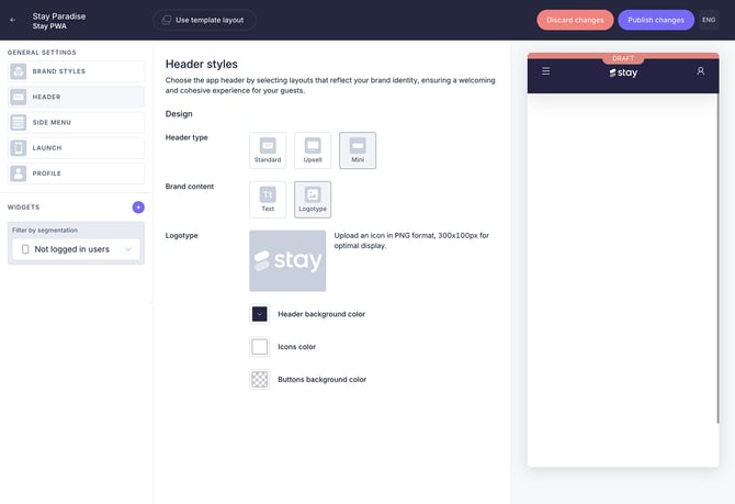
1.1. General settings: Logotype
The logotype can be used in both the Header and the Side menu.
The logo must be uploaded in a horizontal format, as the component height is fixed. Vertical logos will not scale correctly and may appear cropped or too small.
To ensure optimal display, avoid adding margins or padding around the logo. Extra spacing will reduce its visible size within the component.
Recommended specifications:
- Format: PNG
- Image size: 400 x 200 px
- Aspect ratio: 4:2
- Color space: sRGB
- File size: maximum 1 MB
- Background: transparent
To access and configure this component under Header:
- In the CMS, go to My app > Customize app > Edit app.
- Go to Header under General settings
- Select a header type
- Define the background style
- Upload a logotype
- Define colors
- Click Save changes
To access and configure this component under Side menu:
- In the CMS, go to My app > Customize app > Edit app.
- Go to Side menu under General settings
- Upload a logotype
- Define the menu colors
- Edit the menu groups and sections
- Click Save changes
1.2. General settings: Header
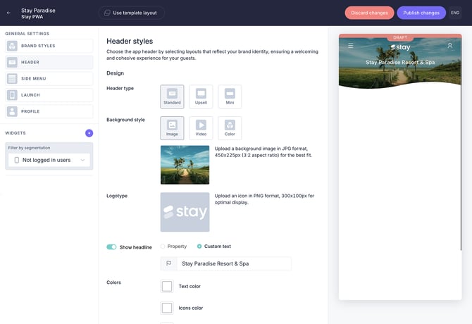
Standard header
Used as the main visual at the top of the home screen.
Recommended specifications
- Format: JPG
- Image size: 450 x 225 px
- Aspect ratio: 2:1
- Color space: sRGB
- File size: maximum 1 MB
To access and configure this component:
- In the CMS, go to My app > Customize app > Edit app.
- Go to Header under General settings
- Select Standard as the header type
- Select Image as background style
- Upload a background image
- Upload a logotype
- Define colors
- Click Save changes
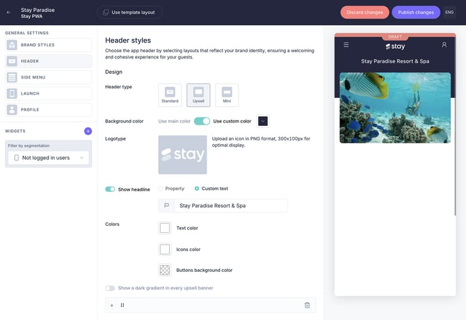
Upsell header
Used to promote services or products through a carousel displayed at the top of the app.
Recommended specifications:
- Format: JPG
- Image size: 380 x 220 px
- Aspect ratio: 4:3
- Color space: sRGB
- File size: maximum 1 MB
To access and configure this component:
- In the CMS, go to My app > Customize app > Edit app.
- Go to Header under General settings
- Select Upsell as the header type
- Define the header settings (background color, logotype, and colors)
- Click Add to create a new item in the carousel (you can add multiple items)
- Select a content source and a content item
- Upload a new image (recommended), or use the image already associated with the selected item
1.3. Home page widgets
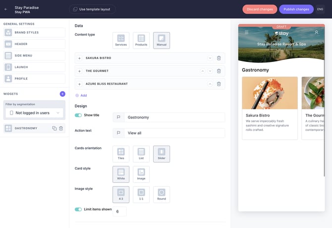
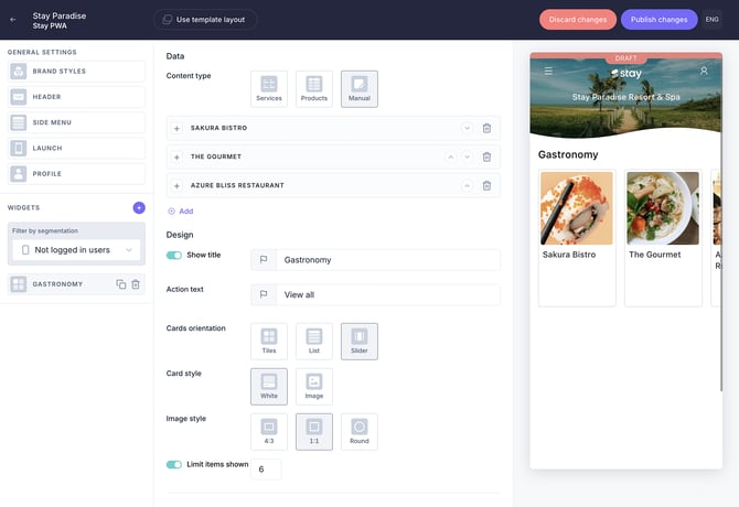
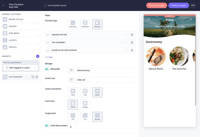
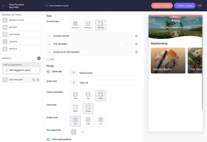
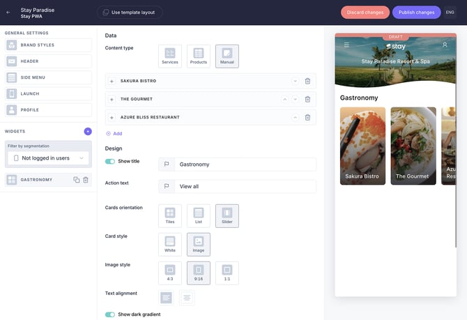
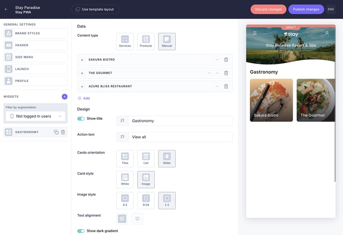
Content widget
Allows uploading custom images for content cards (Manual option under Content type) instead of using service-linked images. This ensures that the slider content is visually distinct and tailored to specific promotions or highlights.
To access and configure this component:
- In the CMS, go to My app > Customize app > Edit app.
- Go to the widgets menu on the left-hand side
- Click + and select Content under Hotel content
- Select Manual as the content type and click Add
- Select a content source and a content item
- Upload an image
- Define title and highlight text
- Under the Design section, select Slider as the card orientation
- Choose White or Image as the card style
- Select the desired image style (4:3, 9:16, 1:1, or Round)
- Define widget visibility
- Save changes
Recommended specifications depending on the selected design options:
Slider - White - 4:3
- Format: JPG
- Image size: 400 x 300 px
- Aspect ratio: 4:3
- Color space: sRGB
- File size: maximum 1 MB
Slider - White - 1:1
- Format: JPG
- Image size: 400 x 400 px
- Aspect ratio: 1:1
- Color space: sRGB
- File size: maximum 1 MB
Slider - White - Round
- Format: JPG
- Image size: 400 x 400 px
- Aspect ratio: 1:1
- Color space: sRGB
- File size: maximum 1 MB
Slider - Image - 4:3
- Format: JPG
- Image size: 400 x 300 px
- Aspect ratio: 4:3
- Color space: sRGB
- File size: maximum 1 MB
Slider - Image - 9:16
- Format: JPG
- Image size: 400 x 800 px
- Aspect ratio: 9:16
- Color space: sRGB
- File size: maximum 1 MB
Slider - Image - 1:1
- Format: JPG
- Image size: 400 x 400 px
- Aspect ratio: 1:1
- Color space: sRGB
- File size: maximum 1 MB
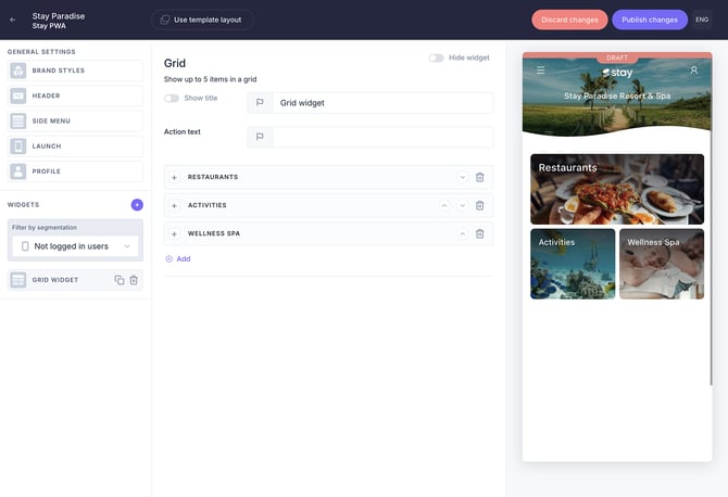
Grid widget
Displays content using a mixed layout with different image formats.
To access and configure this component:
- In the CMS, go to My app > Customize app > Edit app
- Go to the widgets menu on the left-hand side
- Click + and select Grid under Hotel content
- Enter a title and action text, then click Add
- Select a content source and a content item
- Upload an image
- Define a title and highlight text
- Define widget visibility
- Save changes
When adding several items to the grid widget, some may display at full width while others at half width.
Recommended specifications depending on the width:
Top card (full width)
- Format: JPG
- Image size: 600 x 300 px
- Aspect ratio: 3:2
- Color space: sRGB
- File size: maximum 1 MB
Bottom card (half width)
- Format: JPG
- Image size: 400 x 400 px
- Aspect ratio: 1:1
- Color space: sRGB
- File size: maximum 1 MB
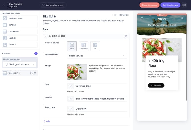
Highlights widget
Shows highlighted content in a horizontal slider with image, text, subtext, and a call to action button.
To access and configure this component:
- In the CMS, go to My app > Customize app > Edit app
- Go to the widgets menu on the left-hand side
- Click + and select Highlights under Hotel content
- Click Add
- Select a content source and a content item
- Upload an image
- Define a title, subtitle, and button text
- Add another item, if needed, and follow the same instructions
- Define widget visibility
- Save changes
Recommended specifications
- Format: JPG
- Image size: 400 x 200 px
- Aspect ratio: 3:2
- Color space: sRGB
- File size: maximum 1 MB
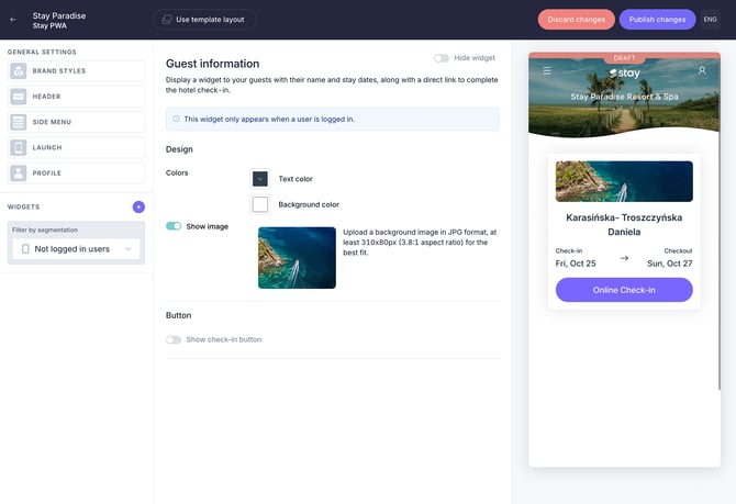
Guest information widget
Displays a widget to guests with their name and stay dates, along with a direct link to complete the hotel check-in. This widget only appears when a user is logged in.
Recommended specifications
- Format: JPG
- Image size: 310 x 80 px
- Aspect ratio: 3:2
- Color space: sRGB
- File size: maximum 1 MB
To access and configure this component:
- In the CMS, go to My app > Customize app > Edit app
- Go to the widgets menu on the left-hand side
- Click + and select Guest information under Interactions
- Define text and background colors
- Activate the Show image button
- Upload an image
- If needed, enable the check-in button and define its settings
- Define widget visibility
- Save changes
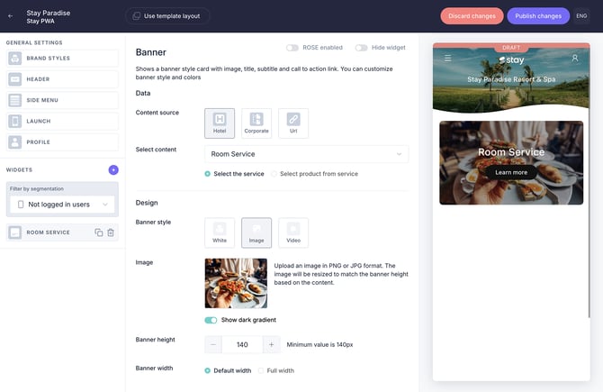
Banner widget
Shows a banner-style card with image, title, subtitle, and call to action link. You can customize banner style and colors
To access and configure this component:
- In the CMS, go to My app > Customize app > Edit app
- Go to the widgets menu on the left-hand side
- Click + and select Banner under Direct links
- Select a content source and a content item
- Select White or Image as banner style
- Select a background color (only if you selected White)
- Upload an image
- Define banner height and width (only if you selected Image)
- Define a title and call to action
- Define widget visibility
- Save changes
Recommended specifications depending on the banner style:
Banner White
- Format: JPG
- Image size: 200 x 200 px
- Aspect ratio: 1:1
- Color space: sRGB
- File size: maximum 1 MB
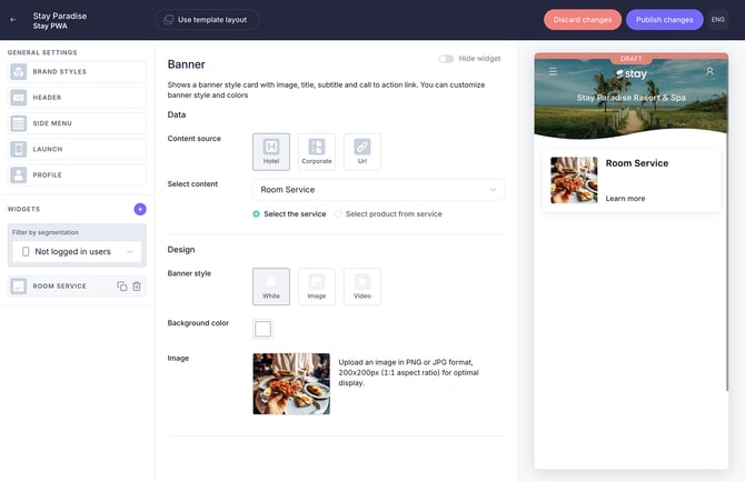
Banner Image
- Format: JPG
- Image size: flexible (depends on content)
- Aspect ratio: flexible (depends on content)
- Color space: sRGB
- File size: maximum 1 MB
The banner height is dynamic and depends on its configuration:
- The height may vary depending on the title size and whether a subtitle is included
- You can also manually define the height in pixels
As a result, both the image size and aspect ratio may vary depending on how the banner is configured.
2. Content section
This section includes image specifications for content created in the Content section of the CMS, such as service details, catalogs, upsell pop-ups, calendar activities, and content group icons.
2.1. Facilities, Services, Leisure, and Welcome message
The following specifications apply to all services created under Facilities, Services, Leisure (excluding the Activities calendar), and the Welcome message.
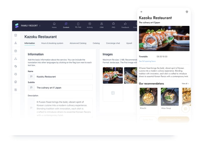
Information tab
Cover image: Main image displayed at the top of the service detail page.
Recommended specifications
- Format: JPG
- Image size: 640 x 360 px
- Aspect ratio: 1:1
- Color space: sRGB
- File size: maximum 1 MB
To access and configure this component:
- In the CMS, go to Content > Facilities/Services/Leisure/Welcome message
- Click the corresponding service type (e.g. Restaurants)
- Select a service in the list and click Edit
- In the Image section of the Information tab, click the image icon to add an image.
- Select one and click Insert
- Save changes
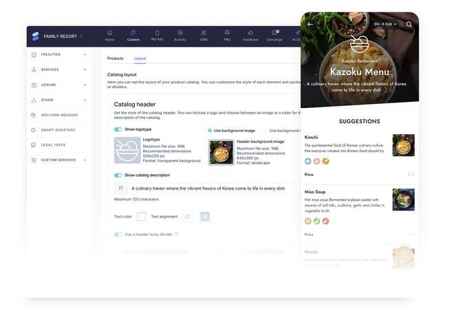
Catalogs
Catalog header: Displayed at the top of the service catalog page.
Recommended specifications
- Format: JPG
- Image size: 400 x 400 px
- Aspect ratio: 1:1
- Color space: sRGB
- File size: maximum 1 MB
To access and configure this component:
- In the CMS, go to Content > Facilities/Services/Leisure/Welcome message
- Click the corresponding service type (e.g. Restaurants)
- Select a service in the list and click Edit
- Go to the Advanced catalog tab
- Scroll down to the Layout tab of the catalog (you should have already created one)
- Select Use background image under Catalog header
- Click the image icon to add an image
- Save changes
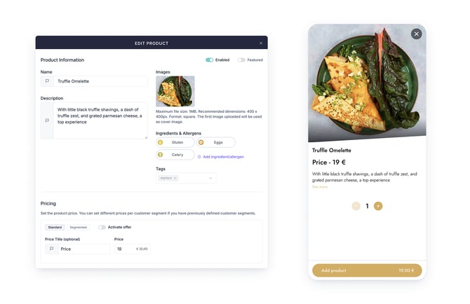
Product image: Main image displayed at the top of the product detail page.
Recommended specifications
- Format: JPG
- Image size: 400 x 400 px
- Aspect ratio: 1:1
- Color space: sRGB
- File size: maximum 1 MB
To access and configure this component:
- In the CMS, go to Content > Facilities/Services/Leisure/Welcome message
- Click the corresponding service type (e.g. Restaurants)
- Select a service in the list and click Edit
- Go to the Advanced catalog tab
- Scroll down to the Products tab of the catalog (you should have already created one)
- Select one product and click Edit (pencil icon)
- Click the image icon on the Product information screen to add an image
- Save changes
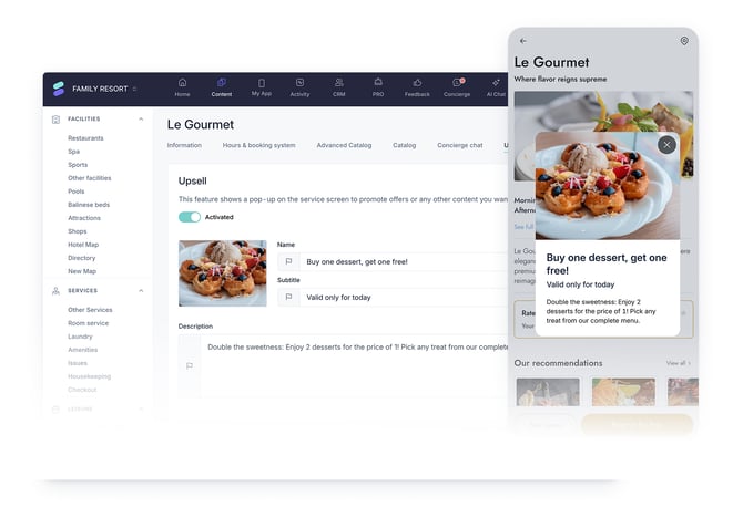
Upsell tab
The upsell pop-up is displayed when promoting a special offer to the guest.
Recommended specifications for the upsell pop-up image:
- Format: JPG
- Image size: 325 x 225 px
- Aspect ratio: 3:2
- Color space: sRGB
- File size: maximum 1 MB
Recommended specifications for the upsell pop-up description:
- Title: 25-35 characters
- Subtitle: 40-60 characters
- Text: 150-200 characters to avoid internal scrolling
To access and configure this component:
- In the CMS, go to Content > Facilities/Services/Leisure
- Click the corresponding service type (e.g. Restaurants)
- Select a service in the list and click Edit
- Go to the Upsell tab
- Enable the Activated button
- Click the image icon to add an image.
- Define the name, subtitle, and description.
- Save changes
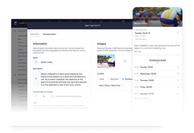
2.2. Leisure: Activities calendar
This section outlines image requirements for activities displayed in the Activities calendar.
Activities are grouped within the calendar and displayed individually in the app, each with its own screen. The activity image appears at the top.
Recommended specifications for an activity image:
- Format: JPG
- Image size: 720 x 400 px
- Aspect ratio: 9:5
- Color space: sRGB
- File size: maximum 1 MB
To access and configure this component:
- In the CMS, go to Content > Leisure
- Click Activities calendar
- Select a calendar in the list and click Edit
- Go to the Activities list tab
- Select an activity and click Edit (pencil icon)
- In the Image section of the Information tab, click the image icon to add an image.
- Select one and click Insert
- Click Save
2.3. Other: Content groups
This section covers image specifications for content group icons displayed in the guest app.
Tab icons
Icons displayed at the top of the guest app screen to represent content groups.
Recommended specifications for icons:
- Format: JPG
- Image size: 200 x 200 px
- Aspect ratio: 1:1
- Color space: sRGB
- File size: maximum 1 MB
To access and configure this component:
- In the CMS, go to Content > Other
- Click Content groups
- Select a content group in the list and click Edit
- Go to the Groups tab
- Select or create a group
- Click the square image icon to add a tab icon
- Save changes
Note: These recommendations also apply to the Tab icons configured under the Groups tab of the New map feature.
.jpg?width=670&height=459&name=Grouping%20(1).jpg)
Map marker icons
Icons displayed on the hotel map to represent content groups and their locations.
- Format: PNG
- Image size: 200 x 200 px
- Aspect ratio: 1:1
- Color space: sRGB
- File size: maximum 1 MB
- Background: transparent
To access and configure this component:
- In the CMS, go to Content > Other
- Click Content groups
- Select a content group in the list and click Edit
- Go to the Groups tab
- Select or create a group
- Click the round image icon to add a map marker icon
- Save changes
Note: These recommendations also apply to the Map marker icons configured under the Groups tab of the New map feature, as shown in the following image.

Next steps
Now that you understand the recommended image specifications:
- Review your existing images in the CMS and update any that do not match the recommended formats.
- Prepare multiple image versions (e.g., 4:3 and 1:1) for key content to ensure flexibility across components.
- Use clear and consistent file naming conventions to simplify image management.
- Test how images display in the guest app after publishing to ensure they appear as expected.
Need further assistance?
If you have additional questions or require further assistance:
- Contact us via live chat
- Send a ticket to our Support team
- Visit STAY Academy, our training platform